Aftershock Simulator - Sprint 16
On sprint 16 in Aftershock Simulator, I assigned the team 87 points and 51 points were finished. We’re beginning to pick up now that we have a plan on what to do. In this sprint, our team started on the tutorial levels and the objectives system. And of course, there was some extra work to do for the UI in the game as well.

As a producer, I still find it difficult to gauge the difficulty of a task, especially when it comes to programming. I still end up needing to change the point values of some cards because they end up more difficult than expected. For example, I had figured that creating the basis for the objectives system wouldn’t have been too difficult, but not necessarily. A few of the objectives require you to click certain UI elements on the screen, and the things that would “listen” to those UI elements are all each in their own separate scripts, so now there’s the added work of finding them and knowing where to put the code. I always end up asking people if they think their cards are 3-pointers rather than 1-pointers, but usually they just find that their cards need to be broken down.


 |
| Objective System Parts |
A cool thing our team was able to do was to be able to add in two new and simple levels. We’ve got an intro level which teaches the user about what earthquakes are, and how to access the USGS info required to assess the situation. There’s nothing too special about it, as all it really is is just a bunch of dialogue. Although, it might be better for the dialogue to be split up more as it does look somewhat hard to read. Instead of a built level, we just have a nice looking background as there’s no map that we really need to pay attention to right now.
Our second level is our camera controls level. All it does is show the player how to zoom, pan, and rotate the camera. Our users are most likely not going to understand these controls naturally, so it’s important that we have this type of tutorial for them. The person who worked on this level basically finished it up in a weekend, which I was pleasantly surprised by. The dialogue flows naturally, too, so there’s not much we need to change. Although, one of the teammates was planning to create a small level, so we’re going to need to swap out the current San Francisco level eventually.

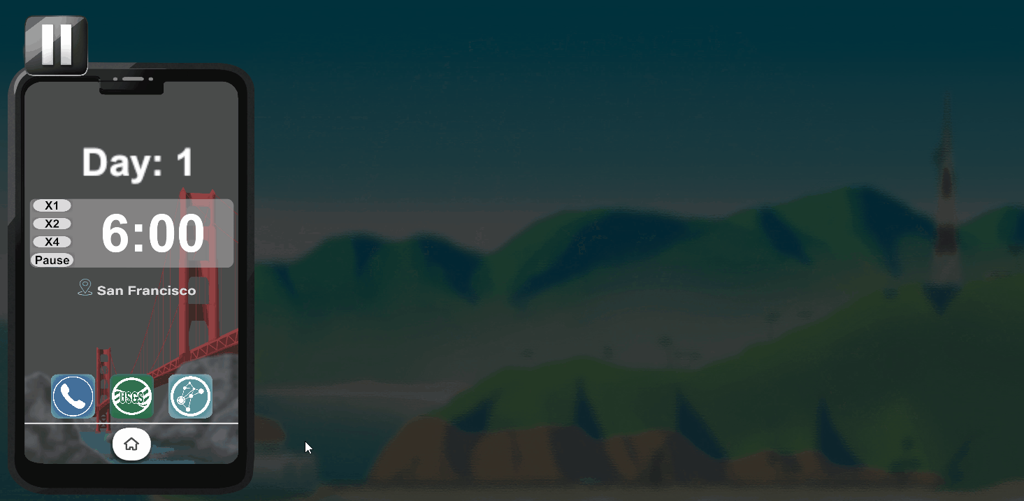
For this sprint, I decided to work on refashioning the simulation access screen so players can access the tutorials. One thing I noticed that was really odd was how most if not all of the UI elements were hard placed into their positions. So the scrollbars don’t actually do any scrolling and if you look at the sprites of the UI elements, they’re kind of just the element itself placed into a bunch of transparent space. I think people used to use sprites like that, but in the modern day, we don’t really need to do that. Plus it makes designing for other aspect ratios more difficult. I was able to fix those issues easily by repurposing a few of the sprites and fixing the placement of all the elements so that they used Unity’s UI system.

I made it a little easier for future programmers to make levels by making it so that they can type in the title and descriptions for their levels a lot easier. If you type [TextArea] above some strings you want to edit in the inspector, you can make the text box a lot bigger so that you don’t have to write paragraphs in the default singular line Unity gives you.


Comments
Post a Comment